Welcome to the ArcGIS tutorial. This tutorial is ideal for unexperienced users. It consists of three parts: . In Tutorial 1, you learn to display, manage, and analyze elevation data in ArcMap. In Tutorial 2, you learn how to handle and present active fault data from a Quaternary fault database for Central Asia. In Tutorial 3, you apply your skills from Tutorial 1 and 2 to create a hazard map that will be used by an international development organization for the purpose of planning their future development sites. If completed successfully you will be ready to explore ArcGIS by your own and use it for other applications. In case you got an error message while following this tutorial, don't give up. You should instead make sure you have followed the previous instructions correctly, if this doesn't solve the problem, you can try to search for the error message in google. You are not the first encoutering a specific problem. Feel free to contact me for any suggestions, especially if you have ideas on how to improve this tutorial (This email address is being protected from spambots. You need JavaScript enabled to view it.).
|
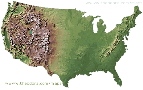
Apply your skills for a geohazard mapping of the Pamir region in Tajikistan. |
||
 |
 |
 |
Note that there are many other ArcGIS tutorials available:
http://desktop.arcgis.com/de/arcmap/
https://learn.arcgis.com/en/ (real world tutorials including some about natural hazard mapping)
https://mgimond.github.io/ArcGIS_tutorials/
http://libraries.uark.edu/gis/tutorial.asp
Tutorial 1: Learn how to display, manage and analyze elevation data in ArcMap.
OBJECTIVE:
The overall objective of this exercise is to give you an overview of ArcGIS, basic GIS operations and tools for digital terrain analysis.
Relative Paths – It is best to set the .mxd’s data source to relative paths so that ArcGIS can find the data referenced in an .mxd if the project and its data are moved to a different drive or folder. To do so:
- click on the Customize menu
- click on ArcMap Options
- Go to General
- Check the box next to “Make relative paths the default for new map documents”
- Click OK.
Note! Save your ArcMap (.mxd file) regularly throughout this exercise.
- Exploring and Visualizing the DEM
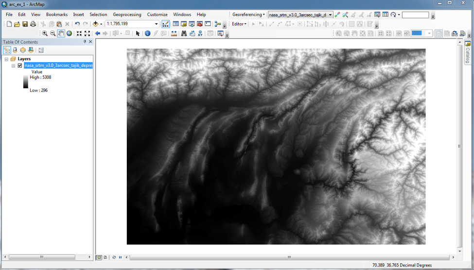
- Start ArcMAP from Start->programs->ArcGIS menu on your windows computer. Begin with a new, blank document in ArcMap. Choose File->Save and navigate to the folder on your USB stick you want to save it to and name the file “arc1_ex_XX” where XX is your initials. Download the elevation data file nasa_srtm_v3.0_3arcsec_tajik_depression.tif.zip, safe it to the same folder and unzip the file. Then, click on Add data button
 and navigate to your folder and click on Add. Your DEM will be displayed as a gray scale image with the lowest values black and the highest values white. It should look like this:
First, create a raster attribute table. Open Toolbox, go to Data Management Tool/Raster/Raster Properties/Build Raster Attribute Table.
You can change this setting in the Layer Properties dialog. To do this, right click on your DEM file in the Table of Contents. Choose Properties from the bottom of the menu, and go to the Symbology dialog. The default setting for grid data is Stretched. Try several of the color ramps to try to improve the visualization of the terrain. Pick one you think will work better than the greyscale default. Click Apply and move the properties dialog aside so you can see what the DEM looks like in the selected map.
Then, click on the Show item Classified. This will divide the values (elevations) of the DEM into a number of groups or bins, each of which can be assigned a different color. The default is for 5 bins. Select the Color Ramp you used before. Click Apply. It may not look good with only 5 classes! Click the Classify button in the upper right of the dialog. The histogram of the distribution of the elevation values is the central feature of the Classification dialog. Make sure the number of classes is 5 and that the Method is Equal Interval. Click OK, and then Apply and look at the DEM as before. If you are not happy with the results, try increasing the number of classes and see what happens.
Review what you have done:
a. Which symbolizations of your DEM do you prefer? Ramp or # of classes? Click OK when you are happy with what you have.
b. Click on the View tab in the main navigation bar. Select Layout View. Then click on Insert in the main navigation bar. Using this menu, insert a title, legend and scale bar for your map. To insert Grids, click on View and select Data Frame Properties. Click on Grids, and create a new grid (Graticule). Click OK. Add your name (required) to the map (Insert->Text). Then go to File->Export Map and save your map as tiff. You will include this map in your final PDF file.
c. Why do you like to display your data this way? Think about what you would like to communicate to the viewer?
- Return to View->Data View. Right click on Layers, and select Properties. Open the Coordinate System tab, and check that the Current coordinate system matches that of the DEM file. Click OK. In the Table of Contents, right click on your DEM file and choose Properties. Answer the following questions:
a. What is the current coordinate system?
b. Number of cells on the x- and y-axis?
c. Total number of cells in the grid?
d. What is the cell size in x and in y?
e. What are the linear units?
Close the Layer Properties dialog. Right click on your DEM file again.
f. Is there an attribute table? Is the grid integer numbers or floating point (real numbers)?
- Before we move to the next section, you need to know about the z-factor. The z-factor is a conversion factor that adjusts the units of measure for the vertical (or elevation) units when they are different from the horizontal coordinates (x,y) units of the input surface. It is the number of ground x,y units in one surface z unit. If the vertical units are not corrected to the horizontal units, the results of surface tools (e.g., Hillshade, Slope, etc.) will not be correct. When we download DEMs in raster format, the spatial reference is usually a geographic coordinate system (versus a projected coordinate system). Using these DEMs to create a Hillshade or a Slope map (something you will do in the next section) with the default values can yield incorrect results. To avoid this, you need to project your DEM using the Project Raster tool. To do this, go to ArcToolbox
 in the main navigation bar: Data Management Tools->Projection and Transformation->Raster->Project Raster. Use your DEM file as the input raster. Select an appropriate location for your output raster. For your Output Coordinate System, click on
  and choose WGS 1984 UTM Zone 43N. After your DEM is projected, you can change the setting in the Layer Properties dialog to enhance how it is displayed. If you don’t know what the ‘UTM coordinate system’ is, or what the ‘WGS 1984’ datum is, then take a minute to google these terms to familiarize yourself with them.
Note! Remember to save your .mxd file.
Note! If you get an error message trying to work with surface tools, try enabling the needed extension by going to Customize/Extensions and tick the box for Spatial Analyst
To turn in: Include your map (with your name typed on it) and answers to questions from Section A in the final PDF file.
B. Surface Analysis
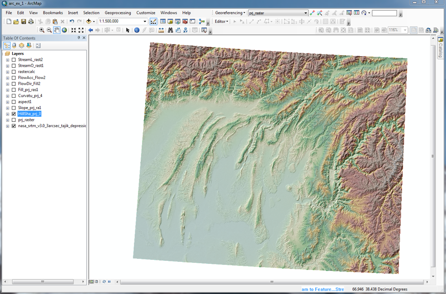
- Hillshade – Now you are ready to create a Hillshade layer. Adding a Hillshade layer under the topography helps increase the ‘realness’ of the map. Hillshade layers are derived from elevation layers. They calculate surface light and shadow based on a sun position. They are used to create a relief perspective. To do so, click on ArcToolbox in the main navigation bar of your ArcMap project. From there, select Spatial Analyst Tools->Surface->Hillshade. Double-click on Hillshade. In the Hillshade dialog, make sure the Input raster points to your projected DEM file. You could also drag and drop your projected DEM file from Table of Contents into the box under Input raster. Save the output raster in your Arc1_exercise_for_students folder. Do not change the default values for Azimuth and Altitude. Do not check the Model Shadows box. Generally, Hillshade DEMs are clearer if the basic elevation layer is multiplied by 2 or 3. In this case changing the Z factor to 2 will multiply the input DEM by 2 before computing Hillshade. Click OK. The Hillshade raster will be automatically added to ArcMap. Right click on your Hillshade layer and go to Layer Properties-> Display and set Transparency to 30%. Save your .mxd file. It should look something similar to this:
Save your Hillshade map by following steps listed under Part 1 (A1-b). You will include this map in your final PDF file.
- Slope, Aspect, and Curvature – Go to ArcToolbox to calculate Slope, Aspect (slope direction), and Curvature. Use your projected DEM raster as the Input raster. Make sure to save your .mxd file. To learn more about these tools, go to Help in the main navigation bar and select ArcGIS Desktop Help. Use the Search tab to look up information on these tools.
a. Explain what each function (Slope, Aspect, and Curvature) does.
b. Why geoscientists would be interested in the output of these functions? For example, are there geomorphic/surface processes we have discussed in class that depend on these parameters?
To turn in: Save all of your maps (4 of them: Hillshade, Slope, Aspect and Curvature) by following steps listed under Part 1 (A1-b). Make sure each map shows title, legend, scale bar, grids, and your name. You will include these maps as well your answers to 2a-b in your final PDF file.
C. Hydrologic Terrain Analysis
In this section, you use the hydrology tools to model the flow of water across your DEM surface. These tools can be applied individually or used in sequence to create a stream network or delineate watersheds. In this exercise, you will use the following tools in the following order: Fill, Flow Direction, Flow Accumulation, Stream Network, Stream Order, Stream Link and stream to Feature.
- Fill - Go to ArcToolbox->Spatial Analyst Tools->Hydrology. Use the Fill tool to fill the sinks in your elevation grid. If cells with higher elevation surround a cell, the water is trapped in that cell and cannot flow. The Fill function modifies the elevation value to eliminate these problems. Double click on Fill and drag and drop your DEM file into the box under Input surface raster. Select Arc1-exercise_for_students folder as the location of your Output surface raster and give it an appropriate name (e.g., …dem_fill). Click OK. The fill layer will be added to your map. This process may take a few minutes. You do not need to turn in this map.
- Flow Direction – This function computes the flow direction for a given grid. The values in the cells of the flow direction grid indicate the direction of the steepest descent from that cell. Go to ArcToolbox->Spatial Analyst Tools->Hydrology. Double click on the Flow Direction tool. Drag your Fill file (from section C1) into the box under Input surface raster. Select Arc1_exercise_for_students as the location of your Output surface raster and give it an appropriate name (e.g., …dem_flow_dir). Click OK. The flow direction layer will be added to your map. This process may take a few minutes.
a. Why is flow direction important in hydrologic modeling?
b. In your map, in what color are the cells flowing west displayed?
Save your flow direction map by following steps listed under Part 1 (A1-b). Make sure your map shows title, legend, scale bar, grids, and your name.
- Flow Accumulation - This function computes the flow accumulation grid that contains the accumulated number of cells upstream of a cell, for each cell in the input grid. Go to ArcToolbox->Spatial Analyst Tools->Hydrology. Double click on the Flow Accumulation tool. Drag and drop your flow direction (from section C2) into the box under Input surface raster. Select Arc1_exercise_for_students folder as the location of your Output surface raster and give it an appropriate name (e.g., …dem_flow_acc). Click OK. The flow accumulation will be added to your map. This process will take several minutes.
Adjust the Symbology of the flow accumulation layer to visualize high-flow pathways more easily. Change the Symbology method to Classified. Use 2 classes. Click Classify Button and select Manual method. Alter the break value for the first class to 5000. Click OK. Change the Symbology (no color for the first class, black for the second class). Click OK. The cells that are displayed in black have the flow of at least 5000 upstream cells flowing through them. This value is important because it defines the minimum catchment area that the calculation is done on. If the value is set too low, then the calculation is done on catchments that are too small to care about for understanding geomorphic processes.
Save you flow accumulation map by following steps listed under Part 1 (A1-b). Make sure your map shows title, legend, scale bar, grids, and your name.
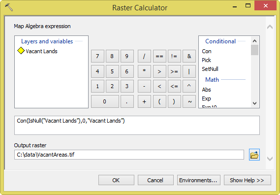
- Stream Network – To delineate stream networks from your DEM, use the output from the Flow Accumulation tool, and apply a threshold value using either Con or Set Null. To do this, go to ArcToolbox->Spatial Analyst Tools->Map Algebra->Raster Calculator. Use the following expression: Con("FAC" > 100, 1, 0) – Note that FAC is your input flow accumulation raster. This expression creates a raster where the value 1 represents a stream network on a background of NoData, assigned to all cells with more than 100 cells flowing into them. All other cells are assigned NoData. This makes it easier for you to view the stream network. Save the stream network map by following steps listed under Part 1 (A1-b). Make sure your map shows title, legend, scale bar, grids, and your name.
- Stream Order–Analyze the stream networks from above using the Stream Order function (located in the Hydrology toolbox). When using the Stream Order tool, apply the default Strahler method to assign a numeric order to links in your stream networks. Save your map by following steps listed under Part 1 (A1-b). The Strahler method (also called Strahler order) is a hierarchical scheme for numbering streams. The number assigned to a stream essentially states how large the stream is and how many tributaries are flowing into it. It is a way of comparing streams of similar size. Make sure your map show title, legend, scale bar, grids, and your name. If you zoom in on your DEM, it should look like this:
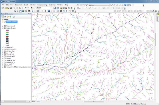
a. Explain what the Stream Order function does and why is its outcome useful.
Note! Save your .mxd file.
To turn in: Save your maps from Section C by following steps listed under Part 1 (A1-b). Your maps are: Flow Direction, Flow Accumulation, Stream Network, and Stream Order. Make sure each map shows title, legend, scale bar, grids, and your name. Include these maps and your answers to questions asked in this section in your final PDF file.
D. Adding Point Data (e.g. sample locations) to your map
In this section, you learn how to add tabular data that contains geographic locations in the form of x,y coordinates to your map. You can create a table in Microsoft Excel, create fields, enter values in the fields, save it as a .csv file (Comma Separated Value) or .txt file. To add x,y coordinates to your map, your table must contain at least two fields, one for the x-coordinate and one for the y-coordinate. The values in the fields may represent any coordinate system and units such as latitude and longitude or meters. Now, follow the steps shown below to add three data points that contain information about three hydrologic stations in Tajikistan.
- Download the hydro_station.csv file to your working folder. Notice the columns: latitude, longitude, station elevation, station name, the start and end dates for operation, and the measurement type. Now that you know what’s inside this file, close it and return to ArcMap. In ArcMap, go to Add Data, navigate to your hydro_station.csv file and add it to Layers. Once the file is added, right-click on it and open it. It should look the same as it was before, except that it is now is inside the ArcMap. Close it, and right-click on it again and go to Display XY Data. The X Field is the Longitude and the Y Field is the Latitude. Leave the Z Field empty. Check the Coordinate System and make sure it is set to: GCS_WGS_1984. Click OK. Turn off all other layers except your projected DEM and Stream Order layers. These maps will be shown underneath the points you just added. Change the Symbology for the points by going to Layer Properties->Symbology and click on the point symbol. Choose a black triangle and increase its size to 18. Click Apply and OK. You can use the Identify icon on the main tool bar
 to obtain more information about each point. Click on and move your cursor to one of the points on the map. Click onit to display information (these are the field values you saw earlier). Close the dialog. Now add the station name for each point as text on your map. It is better to do this in Layout View. Go to View->Layout View, then Insert->Text. Include this map in your final PDF file.
 - Indicate the Stream Order for the rivers where the following hydrologic stations are placed:
Nurak:_________, Mahe Now:__________, Panj:___________
To turn in: Save your map from Section D by following steps listed under Part 1 (A1-b). Your map should include the three station points and their names (all shown over your DEM and Stream Order layers). Make sure your map includes title, legend, scale bar, grids, and your name. Include your map and answer to the above question in your final PDF file.
What To Hand In:
Hand in your answers to questions and all maps from Part 1 as one PDF file (not Word) through the Illias website. Make sure each map shows title, legend, scale bar, grids, and your name. Use section headings (e.g., Part 1, Section A, Question 2a) to indicate what question you are answering.
- To add files to Word or Libre office document before making the PDF file we suggest you: export and save the relevant maps as tiff files from the ArcMap window (go to File -> Export Map). Then insert the tiff files into a MS Word document and save the document as PDF.
- For each map you put in the PDF file add well written figure caption to the map. Write the caption as if you were writing it for a scientific paper or business report. For example, the first sentence of the caption should say in general terms what is plotted. The following sentence should describe how the analysis was done, and what the primary result is that the reader should see in the plot.
- Hand in your final PDF file via the Ilias website.
- No late assignments will be accepted (we’re not kidding).
Tutorial 2: How to handle data and create maps.
OBJECTIVE:
This exercise gives you an overview of data handling and presentation in ArcGIS.
More specifically, in this exercise you will learn:
- To define a coordinate system for your spatial data
- To georeference scanned maps/images
- To digitize, add features and edit attributes of features in ArcMap
- To use an example online fault database for adding fault attributes in ArcMap
You will use the final product of this exercise (i.e., neotectonic map of the Pamir) for Part 3 (final class project) of this exercise to locate suitable sites for new schools to be built by the Central Asia Institute in Tajikistan.
Remember:
- Bring a USB flash drive to class, create a folder and name it ArcGIS_Exercise2. Save all files related to this exercise to your USB drive.
- Set the mxd’s data source to relative paths. See Part 1 of this exercise for instruction.
- Save your ArcMap (.mxd file) regularly.
A. Georeferencing Images
- Start ArcMAP. Begin with a new, blank document. Right click on Layers shown in the Table of Contents. Open Data Frame Properties and go to Coordinate System tab. Note that no coordinate system has been assigned to your layers. Click OK. Download the zip-file containing the DEM nasa_srtm_v3.0_3arcsec_pamir.tif.zip, save the file in your working folder and unzip it. Then click on the Add data button and navigate to your folder where your DEM file is. Select and add nasa_srtm_v3.0_3arcsec_pamir.tif . You will be asked if you like to create pyramids. Click Yes.
Move the cursor over the map. Look at the lower right-hand corner of the page. You will see units displayed in decimal degrees. Geographic coordinate systems (GCS) most commonly have units in decimal degrees measuring degrees of longitude (x-coordinates) and degrees of latitude (y-coordinates). Find out what coordinate system your elevation data are in by examining the layer’s properties.
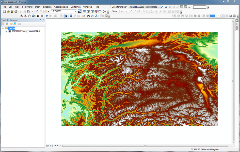
Your DEM is displayed as a gray scale image. Change this setting by choosing a different color ramp to improve the visualization of the terrain. Try picking “Elevation #1” for Color Ramp, and set Type shown under Stretch to Percent Clip. Click Apply. If you are happy with the result, click OK. If not, choose a different setting. Your map may look something like this:
- Some images such as your DEM file (GeoTIFF) contain georeferencing information in their header file. ArcGIS looks for this information when displaying the image. If there is no information available about the location of your image, you will have to georeferenced it manually. Click on the Add data button and navigate to the ArcGIS 2 exercise folder where your JPEG file is. Select and add pamir_neotectonic_map.jpeg. Notice the warning sign: unknown spatial reference! Click OK. To see the image, right-click on the file name and select Zoom to Layer. You should now see the image. Follow the steps shown below to georeference your image:
- Go to your DEM file. You will use it to georeference your image. Display the DEM file and zoom in to the approximate area that is covered by your image to which this layer will be added. This does not have to be exact as it is done just to provide you with an easier workspace.
- In the Georeferencing toolbar (Customize/Toolbars/Georeferencing), select the layer that corresponds with your image (your JPEG file). Then click on Georeferencing button and select Fit to Display. Your image should be displayed over the DEM layer. To georeference/align your image to the DEM data, you need to find features in your DEM layer that are also visible in the image. These features can be streets, buildings, rivers, or topographic features such as basins, mountain ranges, etc. Take a look at your DEM and image and identify features that can be used to align the two layers. These features will be your ground control points that link locations in the image with locations in the DEM layer. To visualize your image and DEM layers together, go to the Layer Properties for your image, click on Display, and set Transparency to 20%. Click OK.
- From the Georeferencing toolbar, select the Add Control Points icon
 .
.

Use your mouse to left click on a known point on the JPEG image. This will place a cross mark on that location. Then, left click on the matching control point in your DEM layer. This will ‘move’ the image and better align the control points. Repeat this step with each control point. It may be a good idea to zoom in on your image when adding control points for increasing accuracy. For every set of control points you create, an entry is created in a table that records the original coordinates, the control point coordinates, and the residual error. Access the table by choosing the View Link Table icon from the Georeferencing toolbar. Entries in this table can be deleted one at a time (highlight the entry in the table and click the delete icon).
- The number of points/links you need to create depends on the method you plan to use to transform the image to map coordinates. However, adding more links will not necessarily yield a better registration. If possible, you should spread out the links over the entire layer rather than concentrating them in one area. Typically, having at least one link near each corner of the image and a few throughout the interior produce the best results. In general, the greater the overlap between the image and your DEM, the better the alignment results since you will have more widely spaced points with which to georeferenced the image. Select at least four links for georeferencing your image.
- After creating your links, you are ready to transform (or warp) the image to DEM layer coordinates. Warping uses a mathematical transformation to determine the correct map coordinate location for each cell in the raster. Use a 1st-order - or affine - transformation to shift, scale, and rotate your image. Straight lines on the image are mapped onto straight lines in the warped raster. Thus squares and rectangles on the raster are commonly changed into parallelograms of arbitrary scaling and angle orientation. A 1st-order transformation will probably handle most of your georeferencing requirements. With the minimum of three links, the mathematical equation used with a 1st-order transformation can exactly map each raster point to the target location. Any more than three links introduces errors, or residuals, that are distributed throughout all the links. In practice, add more than three links. Given only three, if one link is positioned incorrectly, it has a much greater impact on the transformation. Thus, even though the mathematical transformation error may increase as you create more links, the overall accuracy of the transformation will increase as well.
- When you are happy with the georeferencing process, create a new image with the coordinates stored. To do so, go to Georeferencing ->Rectify. Choose an appropriate output location and name for your new image. Click Save.
- Add the new image to your ArcMap project, and uncheck the box next to the old image. Save your .mxd file. Find out what coordinate system your new image is in. In the next section, you will digitize features from your new image into the DEM layer. To do so, you must ensure that your image and DEM layer share the same coordinate system.
B. Digitizing and Adding Data
- The ArcCatalog lets you create new feature classes and modify them by adding, deleting, and indexing attributes. While you can change the structure and properties of a feature class in ArcCatalog, you must use ArcMap to modify its features and attributes. Load your rectified image. Then open ArcCatalog and navigate to your workspace. Right click: New->Personal Geodatabase. Insert ‘active_faults’ for Right-click on it: New->Feature Class. Type in ‘fault_line” for Name and select Line Features for Type. Click Next. Use the same coordinate system as the one you used for your image in the previous section. Click Next. Keep default values for XY Tolerance, and click Next. Under Field Name, enter the following new fields:
NAME (this is the fault name)
EXPOSURE (this indicates the fault exposure level such as exposed, partially exposed, or concealed)
TYPE (this refers to fault type: normal/reverse/strike-slip/thrust)
GEOL_RATE (this is the geologic slip rate given in mm/yr)
GEOD_RATE (this is the geodetic slip rate given in mm/yr)
EARTHQUAKE (this indicates if there is any historic earthquake associated with the fault: Yes/No)
LITERATURE (this field includes all references for the above information, e.g., Schurr et al., 2014 for your image)
Set all Data Type to ‘Text’ with the exception of slip rates which should be set to ‘Double’. Click Finish. The fault_line feature class will be added to your ArcMap project automatically.
- In the main navigation bar, click on Editor
 and Start Editing:

Then, click on Create Feature and select your feature class ‘fault_line’. Choose Line from Construction Tools. Close the window. In the ArcMap main window, make sure your rectified image (slightly transparent) is show over your DEM layer. The red lines (solid and dashed) on your image represent faults that are likely to be active. Choose one of the red lines on this image for digitization. To begin digitizing a fault trace, click with the mouse and follow the trace of the desired fault. It is a good idea to zoom in on your image when digitizing features. Double-click or hit F2 to finish the trace. Save your edits by going to the Editor toolbar, click on Editor->Save Edits.
- To edit the attributes of your features (i.e. fault lines), go to your ‘fault_line’ layer in the Table of Contents. Right-click on it and Open Attribute Table. You will see all columns including the ones you created in ArcCatalog. The attributes you created earlier are editable. For example, you can type in ‘strike-slip’, ‘normal’ or ‘reverse’ for TYPE. For EXPOSURE, you can type ‘exposed’ or ‘concealed’. Use the information shown on your georeferenced image and its legend to fill in the appropriate fields in your attribute table. If the information you need is not shown on the image (e.g., slip rates), leave the field blank. We will return to these empty fields later. When you are done, close the Table and save your edits and the .mxd file.
- To get some practice, repeat steps 2-3 for a few more faults that are likely to be active (i.e., solid and dashed red lines on the image).
- Now, go to https://esdynamics.geo.uni-tuebingen.de/faults/.This is an online database that allows you to access information on active faults in Central Asia. On the main homepage, you see an interactive map. The red lines mark the location of Quaternary faults that are believed to be active. Now, bring your mouse cursor to the map and use your mouse wheel to zoom in on the country of Tajikistan. You should see something like this:
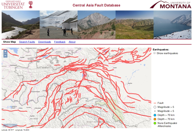
Does this look familiar to you? Click on the fault system to which the black arrow in the above image is pointing. This should take you to an information page specific to this fault system. Use this information to complete the attribute table in your ArcMap project. A few things to keep in mind:
- If you see ‘insufficient data’ shown for slip rate fields in the online database, leave these fields empty in the attribute table in ArcMap. Similarly, if some fields are not shown for some faults in the online database, it means there is insufficient data. Leave these fields empty in the attribute table of your ArcMap project.
- For slip rates that are given in range (e.g., 10-15 mm/yr), take the average value and enter it in the attribute table of your ArcMap project. Save your edits and the .mxd file.
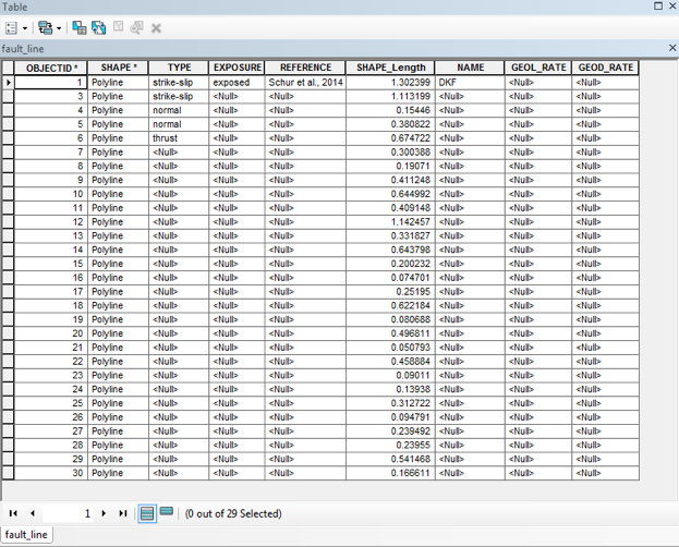
Turn in: Take a screenshot of your completed attribute table and include it in your final PDF file. It should look similar to this (with appropriate values entered in the fields shown as “Null”)”
- Right Click on your fault_line layer and go to Layer Properties. Click on the Symbology tab. Choose ‘Unique values, many’ from Categories in the Show column on the left. Select Type under the Value Fields, and click on Add All Values. You should be able to see different types of faults shown in different symbols. Right click on each symbol to change how it appears. Show all normal faults in red, thrust/reverse fault in black, and strike-slip faults in blue. Increase the line width to 2. Save all your changes. In the Table of Contents, make sure to check the boxes for your DEM and fault_line layers. Uncheck other boxes. You should be able to see you fault lines (color-coded by type) over your elevation map. This is your final map. Make sure it has a title, legend, scale bar, grids, and your name on it.
Turn in: Export your final map as TIFF and include it (with a caption) in your final PDF file.
References
Schurr, B., Ratschbacher, L., Sippl, C., Gloaguen, R., Yuan, X., and Mechie J.: Seismotectonics of the Pamir, Tectonics, 33, 1501–1518, 2014.
What To Hand In:
Please hand in your final map (with appropriate caption) and a screenshot of your final attribute table from Part 2 as one PDF file (not Word) through the Illias website. Make sure your map shows title, legend, scale bar, grids, caption and your name.
- To add files to Word or Libre office document before making the PDF file we suggest you: export and save your map as a tiff file from the ArcMap window (go to File -> Export Map). Then insert the tiff file into a MS Word document and save the document as PDF.
- Add a well written figure caption to your map. Write the caption as if you were writing it for a scientific paper or business report. For instance, explain what your map shows, cite your data sources, and list other useful information such as the coordinate system for your map.
- Include the final attribute table in the PDF file.
- Hand in your final PDF file via the Ilias website.
- No late assignments will be accepted (we’re not kidding).
Tutorial 3: Apply your skills for a geohazard mapping of the Pamir region in Tajikistan.
OBJECTIVE:
The non-profit Central Asia Institute is looking for suitable locations for building their next round of new schools in the Pamir region of Tajikistan. They have recently received a list of potential locations for schools from the Tajik Ministry of Education in Dushanbe. These locations are:
- Vanj (38o22’2” N, 71o27’1” E)
- Murghab (38o10’45” N, 73o58’41” E)
- Vankala (37o43’14” N, 72o16’58” E)
- Langar (37o3’4” N, 72o40’14” E)
To assess the suitability of these sites, the institute has hired you as an independent consultant. The institute is particularly worried about the occurrence of geohazards at/near each site. These include earthquakes, mass wasting events, snow avalanches, and floods including glacial lake outburst floods.
To help the institute make an informed decision concerning the construction of schools at the proposed sites, you will create a series of maps that can be used in hazard assessment. To create these maps and a final assessment report, you will rely on the skills you learned in Part 1 and 2 of this exercise. You are also encouraged to use Google Earth, the online Quaternary fault database for Central Asia (https://esdynamics.geo.uni-tuebingen.de/faults/) and peer-reviewed scientific literature to address the following questions for each site:
- How far is each site from the nearest active fault(s)?
- Is there a fault(s) near each site that is capable of producing M ≥ 5 earthquakes?
- What is the level of seismicity at each site? Is there a record of past earthquakes? What size/depth earthquakes are expected in the area surrounding each site?
- May the expected shaking in response to an earthquake be higher at each site?
- Are there areas with hillslope angles near failure and at risk for future landslides at each site? Is there evidence for past landslides?
- Are the sites at a high risk for snow avalanches?
- Is there a possibility of future ice-dammed lake formation and outbursts at/near each site?
- Are the sites likely to be affected by flood events?
Your report should satisfy these requirements:
- Maximum 5 pages of text, double-space (not including title page, table of contents, figures, references, and an appendix)
- Attach your answers and maps from Part 3a as an appendix to your final report.
- See guidelines listed at the end of this document (Part 3b) for your report structure.
DATA
You can download all required files by clicking on them:
- Elevation dataset: nasa_srtm_v3.0_3arcsec_pamir.tif.zip
- Earthquake dataset: GFZ_aboveM5 and GFZ_belowM5
- Global Vs30 Map: global_vs30.tif.zip
- WHO (2010) hazard maps: WHO_2010_flood.pdf and WHO_2010_landslides.pdf
Other datasets you will use in this exercise:
- Quaternary fault: Your fault_line feature class from the Part 2 of this exercise
Remember:
- Bring a USB flash drive to class, create a folder and name it ArcGIS_Exercise3. Save all files related to this exercise to your USB drive.
- Part 1 and 2 – bring your ArcMap files from part 1 and 2 of this exercise.
- Relative paths- set the .mxd’s data source to relative paths.
- Save your ArcMap (.mxd file) regularly.
PART 3a
A Surface Analysis - Launch ArcMap and add your DEM file: nasa_srtm_v3.0_3arcsec_pamir.tif. Add the x,y coordinate data (location of the school sites) as a layer to your map. Check each site location using Google Earth to make sure they are plotted correctly in Arc. In the attribute table for this layer, make sure to include the name for each site (e.g., Vanj). For more information, see the Part 1 of this exercise (section D: adding point data). After adding school sites to your map, refer to the Part 1 of this exercise (section B: surface analysis) in which you calculated these parameters:
- Hillshade
- Slope
- Aspect
- Curvature
Which of these parameters (or combination of them) may help you with assessing hazards at each site? Check the box next to those relevant to this exercise, and derive them from your DEM in ArcMap. Take some time to investigate each data layer. Display the layers in a way that will help you identify potential geologic hazards in the area.
Answer the following questions for each site:
- In what areas (if any) are the hillslope angles near failure and at risk for future landslides?
- Is there evidence for past landslides?
- What areas (if any) are at a high risk for snow avalanches?
- Take a look at the landslide hazard distribution map developed by World Health Organization in 2010 for Tajikistan. Is this map in agreement with your observations from above? Why or why not?
B. Hydrologic Analysis - Refer to the Part 1 of this exercise (section C: hydrologic terrain analysis) in which you calculated the following:
- Flow Direction
- Flow Accumulation
- Stream Network
- Stream Order (Strahler)
Which of these calculations (or combination of them) may help you with assessing hazards at each site? Check the box next to those relevant to this exercise, and derive them from your DEM in ArcMap. Take some time to investigate each data layer. Display the layers in a way that will help you identify potential geologic hazards in the area. Answer the following questions for each site:
- Are there areas near the site where flooding is more likely to be significant?
- Look at the flood hazard map developed by World Health Organization in 2010 for the country of Tajikistan. Is this map in agreement with your observations from above? Why or why not?
C. Earthquake Data Analysis – Refer to the Part 2 of this exercise (section B: digitizing and adding data) in which you created the following data layer:
- Fault_line (feature class) and related Attribute Table
Load the fault lines into your ArcMap project. Then refer to Part 1 of this exercise (section D: adding point data) to add the earthquake files (GFZ_aboveM5 and GFZ_belowM5) to your current ArcMap project. Show earthquakes <70 km in depth in orange circles (these are shallow, crustal earthquakes) and those >70 km in blue (these are intermediate-deep earthquakes). Increase the size of your symbol for earthquakes larger than magnitude 5. Keep in mind that your earthquake dataset covers a two-year period (2008-2010).
Optional: For a longer earthquake coverage period (1900-2014), please go to https://esdynamics.geo.uni-tuebingen.de/faults/ and check the box next to “Show Earthquakes” in the interactive map. Then select events from the ANSS ComCat.
Display your DEM together with the earthquake and fault data and use these layers to answer the following questions for each site:
- Are there earthquakes near your site? If so, describe their size and depth.
- How far is your site from the nearest active fault(s)? Describe the fault(s) (e.g., name, seismic history if known, and slip rates if available). Is the fault(s) capable of producing M ≥ 5 earthquakes?
- Is there a possibility of earthquake-induced mass wasting at or near each site? (take a look at maps from section A of this exercise).
Deselect the earthquake and fault layers in the Table of Content in ArcMap. Now load the global_vs30.tif file. This shows the average shear-wave velocity down to 30 meters across the area. It gives an indication of whether the expected ground shaking in response to an earthquake may be higher. At a bedrock site (high shear-wave velocity), there will be little amplification of seismic waves. In a sedimentary basin (low shear-wave velocity), one might expect intense amplification. Change the display setting so that areas with low shear velocity are shown in red/orange and areas with high shear velocity are shown in blue/green. Take a look at your result. Investigate and identify locations where one may expect higher shaking in your study area.
- May the expected shaking in response to an earthquake be higher at/near the sites?
Turn in: Include your maps and answers to questions from above sections as an Appendix to your assessment report in the final PDF file. Make sure your maps show title, legend, scale bar, grids, and your name. To create and save your maps, see the steps shown in section A1-b in the Part 1 of this exercise.
Part 3b
Report Guidelines
The following section explains the general structure and content that should be included in your final assessment report. Your report should be maximum 5 pages in length (not including title page, table of contents, references, figures and the appendix). Your report should contain the following sections:
Title Page
Table of Contents
Introduction
Study area
Methods
Results
Discussion
Recommendations
References
Appendix
Each section is described below.
Title Page – The title page should show the report’s title, your name, and submission date (month/year). Remember a good title predicts content and reflects the tone of the report.
Table of Contents – In the Table of Contents, include the names of all the headings and subheadings in the main text and relevant page numbers. Include a list of all figures and appendices with relevant page numbers.
1. Introduction
In this section, include the overall purpose of your assessment report and its significance. Use the subheadings shown below and add new ones as you see fit.
1.1 Objectives (problem statement)
1.2 Significance of the Problem
2. Study area
In this section, describe the study area (Pamir region of Tajikistan). For the Pamir region (or alternatively for each school site) provide general information on the type and abundance of geohazards. You may include information on the type and extend of damage caused by previous geohazards in the region (and/or near each site). Cite references to published literature to support your statements. Include relevant figures (e.g., study locations) in this section. You may consider creating subheadings like the one shown below for each site:
2.1 Vanj valley, Western Pamir (school site: Vanj)
3. Hazard Mapping
This is your methods section. Describe your assessment process (in words or using a flow chart). Give details on input datasets (explain data types, sources, coverage periods, etc.). Describe all tools used (e.g., ArcGIS) to identify and understand the level of hazards at each site. Use subheadings like the ones shown below, and add new ones as you see fit.
3.1 Methods
3.2 Datasets
4. Results
Start this section with a short paragraph that explains the items presented in the subsections. This orients the readers’ brain towards what will be presented and the logic behind your organization. This section should only present observations. Interpretations should not be mixed with observations. Create subheadings like the ones shown below for each observation. Include figures (and captions) to support your observations.
4.1 Surface Observations
4.1.1 Vanj Site in Western Pamir
...
4.2 Hydrologic Observations
4.2.1 Vanj Site in Western Pamir
...
4.3 Earthquake Observations
4.3.1 Vanj Site in Western Pamir
…
5. Discussion
In this section, you present your interpretation of the results. For example, explain how your observations of slope distribution (from 4.1 for example) near a school site relate to potential hazards at the site. Create subheadings like the ones shown below for each site. Include figures (and captions) to support your interpretations.
4.1 Potential hazards at Vanj school site
…
5. Recommendations
Conclude the assessment report by proposing recommendations for school construction at each site. Your recommendations should be based on your data analysis and interpretations. It may be useful to create a bullet list of recommendations relevant to each school site. Explain any shortcoming in your assessment and your recommendations for including other datasets for a more comprehensive hazard assessment study in the region.
6. References - Ensure that every reference cited in the report is also present in the reference list (and vice versa). References can be in any style or format as long as the style is consistent.
What To Hand In:
- Hand in your final assessment report (Part 3b) as one PDF file (not Word) through the Illias website. In your final PDF file, also include your work from Part 3a as an appendix.
- To add files to Word or Libre office document before making the PDF file we suggest you: export and save the relevant maps as tiff files from the ArcMap window (go to File -> Export Map). Then insert the tiff files into a MS Word document and save the document as PDF.
- For each figure you put in the final PDF file, add well written figure caption. The first sentence of the caption should say in general terms what is plotted. The following sentence should describe how the analysis was done, and what the primary result is that the reader should see in the plot. Your figure/map must show title, legend, scale bar, grids, and your name.
- Hand in your final PDF file via the Ilias website.
- No late assignments will be accepted (we’re not kidding).